
hoosing the right business card design shapes how people view your brand. Colors create strong impressions. They can make your company look modern, trustworthy, bold, or creative. A well-planned color palette also ensures that your contact details remain clear and easy to read.
In the vibrant UAE market, businesses compete across many fast-growing industries. Therefore, a professional visual identity helps your business stand out. Whether you require Office Busines card printing, customized letterheads, or promotional displays, color consistency builds brand trust across all marketing channels.
Why Color Selection Matters
Color influences emotional reactions instantly. For example, blue suggests trust and stability. Red creates energy and urgency. Green represents growth and sustainability.
However, you should not choose colors merely because they look attractive. Your colors must support your core business message. A law firm requires a calm and serious palette. Conversely, a creative studio benefits from vibrant tones.
In addition, print colors can differ from digital screen previews. Screen pixels emit light, whereas paper absorbs ink. For that reason, working with a reliable near me printing press ensures accurate color output on physical paper.
Top Color Combinations for Business Card Design
Selecting harmonious colors strengthens your brand presence. Here are five effective color combinations for modern business cards:
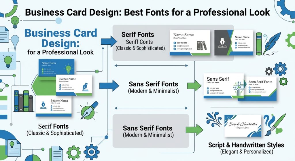
1. Navy Blue and White
Navy blue and white create a clean, corporate, and trusted image. This combination suits banks, consultancies, and corporate firms. White text delivers high contrast against dark blue backdrops. Consequently, contact details stay clear. Adding subtle gold foil accents elevates the premium feel.
2. Black and Gold
Black and gold convey luxury and elegance. This palette works exceptionally well for high-end real estate, jewelry brands, and luxury retail. Black provides a solid base, while gold highlights logos and headers. However, use gold accents carefully to avoid cluttering the visual layout.
3. White and Dark Green
White and dark green deliver a fresh, natural aesthetic. Environmental services, wellness centers, and organic brands frequently choose this palette. Dark green builds visual stability, while white maintains a clean structure. A light green secondary shade adds depth without creating visual noise.
4. Red and White
Red and white form a high-impact, energetic pairing. Red captures attention immediately, while white provides balanced contrast. Fast food outlets, sports brands, and retail stores benefit from this dynamic look. Use red strategically on key elements like logos or contact titles.
5. Classic Black and White
Black and white remain timeless choices for minimalist designs. This palette offers maximum contrast and exceptional readability. It functions well across every industry sector. A black background with crisp white text looks sleek, while a white card with bold black text offers effortless elegance.
Selecting Colors for Your Industry
Different industries benefit from tailored color schemes. Selecting standard industry colors helps customers identify your services instantly:
- Corporate Services: Navy, white, dark blue, and charcoal gray build strong trust.
- Luxury Brands: Black, gold, cream, and deep forest green convey prestige.
- Hospitality and Dining: Red, warm orange, rich brown, and tan stimulate interest.
- Technology Firms: Blue, electric purple, crisp black, and pure white suggest innovation.
- Healthcare and Medical: Soft blue, mint green, white, and light gray project clean calm.
- Creative Agencies: Bold primary hues combined with neutral backdrops highlight imagination.
Besides standard print, modern companies integrate emerging technologies into their displays. If you want unique promotional items, exploring a 3d printing service near me provides innovative custom branding tools.
Contrast and Readability Essentials
Good visual contrast remains essential for high-quality business card design. Text must remain legible at a single glance. Dark text on light backgrounds offers the clearest contrast. Similarly, bright white typography reads easily on navy or black surfaces.
Avoid placing light gray typography on white stock. Although muted colors appear sleek on bright screens, they often disappear on paper. Likewise, avoid combining two vivid colors without high contrast. Simple visual hierarchy helps key information stand out smoothly.
Maintaining Brand Consistency Across Print Media
Your business card should never exist in isolation. It must match your wider promotional assets, including corporate letterheads, envelopes, and presentation folders. Using identical color codes across all materials establishes instant recognition.
When expanding outdoor advertising, businesses searching for banner dubai solutions must keep color codes unified. Consistent branding across cards, banners, and signage forms a cohesive corporate image.
Furthermore, for specialized recognition products, corporate awards, and luxury gifts, companies can partner with premium providers like Crystal Palace to complement their printed stationery.
Choosing the Right Paper Finishes
Paper finishes alter how printed colors appear in person:
- Matte Finish: Offers a smooth, non-glare surface that enhances classic readability.
- Glossy Finish: Boosts color saturation, making vibrant palettes look brighter.
- Soft-Touch Finish: Gives cards a velvety texture for a luxurious tactile impression.
- Foil Stamping: Adds metallic luster to logos, matching dark backgrounds beautifully.
Why Work with AL IZRA ADVERTISING GIFT TRADING L.L.C.?
In the vibrant and competitive landscape of the UAE, where businesses constantly strive for excellence and visibility, AL IZRA ADVERTISING GIFT TRADING L.L.C stands out as a beacon of quality, innovation, and customer-focused service. With a deep understanding of market dynamics and a passion for visual storytelling, we help brands shine in a cluttered marketplace.
At AL IZRA ADVERTISING GIFT TRADING L.L.C, we are not just a signage manufacturing company; we are your strategic partner in elevating brand visibility and communication. Based in the heart of the UAE, we specialize in creating diverse and innovative signage solutions that help businesses leave a lasting impression.
We are committed to transforming your brand’s vision into captivating visuals. With a focus on quality craftsmanship, personalized service, and cutting-edge technology, we ensure that your signage not only stands out but also effectively communicates your brand identity. Trust AL IZRA to elevate your business with exceptional signage that makes a lasting impression.
Conclusion
Choosing the best colors for your business card depends on your industry, brand message, and target market. Classic palettes like navy and white build corporate confidence, whereas black and gold project luxury. By maintaining strong contrast, selecting quality paper finishes, and keeping colors consistent across all print media, your brand leaves a powerful impression. Partner with AL IZRA ADVERTISING GIFT TRADING L.L.C. today to bring your print and signage ideas to life.