
A strong business card design helps your brand look professional, trustworthy, and memorable. Your card creates a fast first impression. Every detail matters, including the typography.
The right typeface makes your name easy to read. It shows your brand personality clearly. However, the wrong font choice makes a card look messy. For this reason, companies must select typography with care.
In the UAE, physical cards remain vital for networking, meetings, events, and client visits. A well-planned business card design supports your overall corporate identity effectively.
Why Typography Matters in Business Card Design
Fonts do much more than show words. They communicate your overall brand style.
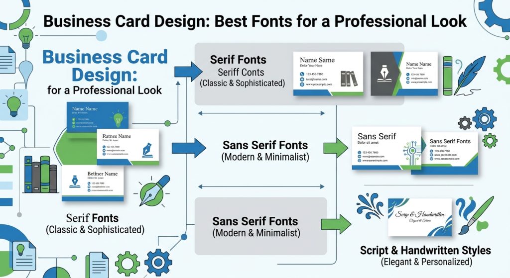
For instance, a bold sans-serif font creates a modern look. On the other hand, a serif typeface adds a classic feel. Readability must always come first in every layout. Your contact details should remain easy to scan.
Cards offer limited space. Therefore, large decorative lettering should not crowd the layout. Instead, use clean typefaces for essential information.
- Your name
- Company name
- Phone number
- Email address
- Website URL
Font size plays a crucial role too. Small text might look neat on a screen. However, thin letters become hard to read after printing.
The Best Fonts for Your Business Card Design
Many typefaces work well for corporate stationery. Certain classic options provide reliable readability and clean visual style.
1. Helvetica
Helvetica remains a top choice for simple layouts. Its balanced letterforms create a clean image. Modern tech companies, consultants, and corporate firms use it often. You can easily pair bold headings with regular body text.
2. Arial
Arial provides a clear and familiar look. It works well when you must include multiple details. Moreover, it offers a safe choice for practical business layouts across diverse industries.
3. Futura
Futura features a clean geometric design. Its crisp lines give cards a distinct appearance. Design studios, fashion brands, and architects prefer this style. However, avoid using tiny font sizes with geometric shapes.
4. Montserrat
Montserrat serves modern branding efforts well. It offers strong letterforms and versatile weights. Designers use bold Montserrat styles for headers while keeping supporting text clean.
5. Garamond
Garamond provides an elegant serif style. It helps a card feel established and refined. Law firms, luxury brands, and traditional institutions benefit from this choice.
6. Georgia
Georgia is a highly readable serif font. Its balanced letter shapes feel warm yet formal. Consequently, it suits companies that want a traditional touch without looking old-fashioned.
7. Poppins
Poppins delivers a fresh geometric structure. It works exceptionally well for digital-first companies. Furthermore, its diverse weight options help establish visual hierarchy effortlessly.
8. Roboto
Roboto offers a friendly, modern sans-serif structure. The letters feature open shapes, which allows smooth reading. Technology startups and service providers choose Roboto frequently.
9. Open Sans
Open Sans delivers excellent readability on print surfaces. It works great when your layout contains long details. Additionally, its approachable style fits almost every commercial sector.
10. Baskerville
Baskerville adds a high-end serif touch. Luxury retailers, hospitality groups, and premium advisors use Baskerville to showcase elegance.
How to Select the Right Fonts for Business Card Design
Choosing a typeface starts with understanding your core brand identity. Consider the specific message you want to send clients.
- Modern look: Select a clean sans-serif font like Poppins or Helvetica.
- Established image: Choose a classic serif font like Garamond or Georgia.
- Creative style: Explore distinct geometric typefaces like Futura.
Never choose a typeface simply because it looks pretty. It must remain readable at actual size. Test your typography choices against your logo to ensure complete visual harmony.
Combining Two Fonts for Clear Hierarchy
Using two typefaces creates nice visual structure. However, mixing too many fonts causes visual clutter.
A smart technique uses one font for headings and another for details. For instance, combine a Montserrat header with Open Sans body text. Alternatively, use single font families with contrasting weight variations. This approach creates contrast while preserving design consistency across all letterheads and collateral.
Matching Fonts to Specific UAE Industries
Different business fields demand distinct design choices. Financial firms usually favor clean serif or traditional sans-serif typography. Meanwhile, creative agencies prefer custom geometric fonts.
Restaurants often try stylish decorative headers. Technology teams choose simple, modern fonts. Luxury sellers select elegant serif styles to highlight quality. Your card should seamlessly match your wider identity.
Font Selection and Office Business Card Printing
Typography decisions carry directly into physical production. During Office Busines card printing, every font must undergo testing at actual scale. Thin lines often lose clarity on paper. Fine strokes might fade depending on stock choice.
Paper finishes also alter letter appearance. Smooth coated papers show sharp letter edges. Textured papers create a softer feel.
Special embellishments add extra luxury. Foiling, embossing, and spot UV details highlight text nicely. However, these features should never reduce overall reading comfort.
Finding the Right Layout Balance and Font Size
Text sizing requires careful attention. Your personal name deserves the primary visual focus. Meanwhile, supporting contact information should remain easy to read.
Avoid crowding your layout with unnecessary information. Leave generous blank space around text blocks. Clean white space boosts readability significantly. It helps your card look balanced and stylish.
Coordinating Your Cards with Letterheads and Corporate Stationery
Your business cards must match all other physical stationery items. Using uniform fonts across letterheads, envelopes, and folders builds brand trust.
Clients may see your business card first. Later, they might receive an invoice, proposal, or letter. Consistent typography makes your company easy to recognize. Therefore, font choices should support your complete branding strategy.
Essential Steps Before Sending Files to a Near Me Printing Press
Always review artwork files carefully before final production starts.
- Verify names, job titles, and contact information.
- Confirm correct web URLs and email addresses.
- Check font sizing at exact scale.
- Review color contrast against background elements.
Partnering with a local near me printing press helps catch design errors early. Print proofs confirm that fine details print accurately before large runs start.
While a 3d printing service near me handles physical objects, professional business cards demand high-definition offset or digital printing equipment. Similarly, outdoor marketing calls for large-format solutions like a banner dubai supplier. Every promotional channel requires specialized equipment.
Common Typography Errors to Avoid
Simple font mistakes can weaken an otherwise great design.
- Using too many fonts: Stick to two complementary fonts.
- Overly decorative styles: Avoid fancy script fonts for small contact info.
- Tiny font sizes: Never sacrifice readability to save space.
- Low contrast: Ensure dark text rests on light backgrounds.
- Brand misalignment: Avoid choosing fonts that clash with your logo.
Avoiding these common mistakes leads to better outcomes.
Partnering with AL IZRA ADVERTISING GIFT TRADING L.L.C.
In the vibrant and competitive landscape of the UAE, where businesses constantly strive for excellence and visibility, AL IZRA ADVERTISING GIFT TRADING L.L.C stands out as a beacon of quality, innovation, and customer-focused service. With a deep understanding of market dynamics and a passion for visual storytelling, we help brands shine in a cluttered marketplace.
At AL IZRA ADVERTISING GIFT TRADING L.L.C, we are not just a signage manufacturing company; we are your strategic partner in elevating brand visibility and communication. Based in the heart of the UAE, we specialize in creating diverse and innovative signage solutions that help businesses leave a lasting impression.
About Al Izra Advertising Gift Trading LLC
We are committed to transforming your brand’s vision into captivating visuals. With a focus on quality craftsmanship, personalized service, and cutting-edge technology, we ensure that your signage not only stands out but also effectively communicates your brand identity. Trust AL IZRA to elevate your business with exceptional signage that makes a lasting impression.
For premium corporate awards and recognition items, explore luxury options at Crystal Palace.
Conclusion
The best fonts for corporate cards offer clear readability and match your brand identity. Helvetica, Arial, Montserrat, Poppins, Garamond, and Georgia remain top options. Keep your typography simple, maintain strong contrast, and preserve clean white space. Pair your typography with expert printing to turn simple business cards into powerful branding tools.