
What is the best way to balance text and graphics in business card design? A strong card must look clean, modern, and very easy to scan. However, limited space makes every design choice important. Too much text creates a crowded surface. Too many icons make basic details hard to locate.
A balanced layout gives equal attention to brand visual appeal and key details. It guides the reader smooth from your company logo straight to your contact info. For ambitious companies across the UAE, smart business card design builds lasting customer trust. It also aligns perfectly with your letterheads, custom banners, packaging, and wider marketing tools.
At AL IZRA ADVERTISING GIFT TRADING L.L.C., we help brands build clear visual identities. Based in the heart of the UAE, we create custom visual solutions that leave a lasting impression.
Why Balance Matters in Business Card Design
Your card is often the very first print item clients receive. It shapes their opinion of your brand within seconds.
However, one small print piece cannot tell your full story. Instead, it should highlight essential information.
A modern card should include:
- Brand name and logo
- Your full name and job title
- Phone number and email address
- Website link and social handles
- Physical office location
Graphics should always support this primary information. They must never compete with key details.
For example, a giant logo can easily crush the layout. A heavy pattern can lower text contrast.
A balanced arrangement solves these common visual issues. It gives every critical piece of text room to breathe.
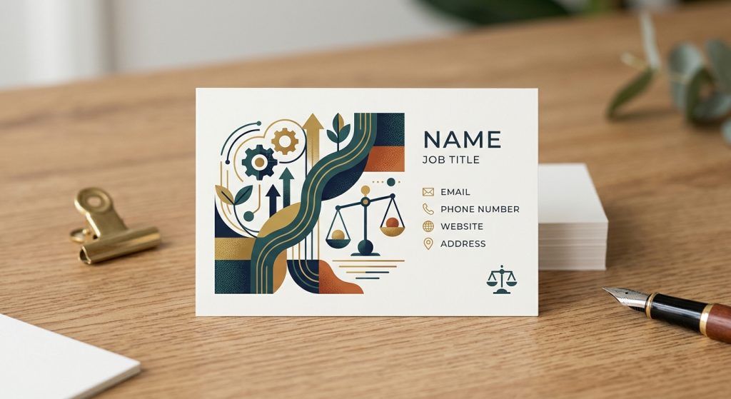
+---------------------------------------------------+
|  [ BRAND LOGO ]                                   |
|                                                   |
|  FIRST & LAST NAME                                |
|  Job Title / Role                                 |
|                                                   |
|  Phone: +971 XX XXX XXXX                          |
|  Email: name@company.com                          |
|  Web: www.company.com                             |
+---------------------------------------------------+
Smart Business Card Design Layout Techniques
Visual hierarchy helps people read your details quickly. It creates a simple path for the eyes to follow.
Start with your bold brand name or logo at the top. Next, display the individual’s name and corporate role. Finally, present your main contact details.
Font sizes also establish clear reading priority. Use a larger font for your personal name. Apply a medium weight for the brand title. Set contact details in a smaller, clean font.
Furthermore, keep your typographic choices strict. Using two or three font sizes is ideal for clarity.
Spacing also improves layout reading order. Adding open margins around core details makes them pop instantly.
Use Graphics to Support Your Visual Message
Graphics should display your visual identity instead of filling empty spaces.
Your corporate logo serves as the primary graphic anchor. Therefore, it must remain sharp, clear, and easy to recognize.
You can also add simple lines, light shapes, or small icons. These clean elements help separate distinct content blocks.
- A thin dividing line separates names from contact details.
- A small phone graphic highlights your contact line.
- Simple geometric accent shapes reinforce corporate colors.
However, decorative graphics must always stay secondary.
Avoid adding complex decorative artwork. Unrelated graphics distract target readers from core business details.
Likewise, select custom images with great care. Photos can work for creative agency fields. Yet, they rarely suit corporate print layouts.
Keep Text Easy to Read Across All Media
Text clarity is essential when sharing contact details.
Select clean, highly professional fonts for small text. Sans-serif fonts offer modern, crisp readability. Serif fonts bring traditional elegance to luxury visual identities.
Avoid decorative scripts for phone numbers and email lines. Important details must remain simple to scan.
Text size plays a massive role in final print quality. Tiny text looks great on digital displays. However, it often turns blurry on physical card-stock.
Maintain high contrast between text layers and paper backdrops. Dark text over light card-stock remains the easiest option to read.
Choose a Simple Color Palette for Your Brand
Colors connect text elements with visual graphics. They also strengthen company memory across local markets.
Start with your primary company color choice. Next, pick one or two accent shades to build depth.
For example, a corporate group might select deep blue as a base. Clean white offers open neutral space. A bright cyan highlights subheadings or website links.
Avoid mixing too many vivid colors together. They fight for reader focus and confuse the eye.
Furthermore, apply this exact color rule across all company collateral. Match your cards with your company letterheads and display banners. Consistent color schemes help clients recognize your brand everywhere.
Balance Front and Back Business Card Design
Double-sided layouts give you extra surface area to sort information.
The front side focuses on primary visual branding. It highlights your logo, company name, personal name, and job title.
The reverse side stores structured contact details. It can also hold a digital QR code, website URL, or short service list.
This approach prevents cluttered card layouts.
However, both sides must share a strong unified design language. Use matching brand colors, font sets, and visual line styles.
Do not create two distinct visual themes. Both sides must feel like parts of one complete identity.
Use White Space Strategically to Increase Quality
White space is never wasted printing area. It is actually one of your strongest design assets.
It separates distinct text groups effortlessly. It also brings instant focus to important contact items.
For instance, leaving empty space around a name makes it stand out. Similarly, open margins near a logo boost brand recognition.
A crammed card looks cheap, even on premium card-stock. Conversely, a clean card looks luxurious when spacing is balanced well.
Therefore, remove unnecessary graphics before shrinking your visual white space.
Master Typography and Font Pairing
Combining two complementary fonts creates pleasing visual contrast. However, the selected type styles must work well together.
Use one font family for primary names and titles. Use another clean font family for contact listings.
Avoid mixing three or four different font styles. That practice leads to unorganized, messy layouts.
Font weights also generate contrast without adding visual clutter. A bold name stands out without needing a completely new font family.
For example, use a bold weight for the company title. Then use regular weights for phone lines and emails.
The final result stays consistent, balanced, and simple to digest.
Keep Contact Details Clean and Organized
Contact lists need a logical layout structure.
Arrange details in a straight vertical stack. Use tiny, simple icons to guide reader eyes down the list.
[Icon] Phone: +971 XX XXX XXXX
[Icon] Email: name@company.com
[Icon] Web: www.company.com
[Icon] Location: Dubai, UAE
Avoid adding long promotional copy. A business card is not a marketing flyer.
If your enterprise provides dozens of services, list only the core offerings. Direct readers to your main site for full service lists.
This disciplined approach keeps your print design sharp and efficient.
Add QR Codes Without Crowding Your Business Card Design
QR codes offer fast digital paths to your online world. They link directly to websites, portfolios, or digital contact cards.
However, a QR code should never overwhelm the layout.
Leave plenty of quiet white space around its border. Make sure the printed size remains large enough for cameras to read.
Test your printed QR codes before starting full production. Codes that work on screens might fail on textured paper.
Add a brief text prompt right near the code. A simple line like “Scan to Connect” guides user action.
The code must support your overall layout rather than act as the central feature.
Match Your Card to Other Printed Materials
Your business card design forms one piece of a complete brand system.
For instance, corporate letterheads should use matching fonts and colors. Large event banners must follow the exact same brand rules.
This visual unity is essential when clients view multiple company items.
A unified visual identity builds serious corporate credibility.
If you are searching for a near me printing press, evaluate their ability to match colors across products. Consistency separates average brands from market leaders.
The same rule applies to large promotional graphics. A major banner dubai installation must align with your small cards.
Consider Printing Specs for Best Quality
Great layout choices must translate cleanly onto physical paper.
Colors can shift slightly during actual ink application. Fine text lines can lose sharpness on dark stock.
Therefore, always prepare artwork files using precise print standards.
- Set high-resolution image files (at least 300 DPI).
- Verify full bleed settings and safety margins.
- Convert all embedded font files into vector outlines.
Professional print shops also offer premium surface finishes:
- Smooth matte lamination
- Ultra-gloss lamination
- Selective spot UV gloss
- Metallic foil stamping
- Deep paper embossing
- Clean rounded corners
These custom touches elevate tactile appeal. However, pick finishes that reflect your brand personality.
Luxury real estate brands benefit from gold foil. Modern tech startups often prefer smooth matte finishes.
Avoid Common Business Card Design Mistakes
The single biggest design mistake is trying to show too much.
A tiny card does not need three logos, large photos, long paragraphs, and dozens of social icons.
Instead, focus strictly on three visual elements:
- Core brand identity
- Individual name and role
- Direct contact methods
Every added line or icon must serve these three elements.
A minimal card displays true visual confidence. It also lets prospective clients find vital information instantly.
Partner with Experts for Professional Brand Execution
Professional design is far more than simple decoration. It builds a powerful physical bridge between your company and your target market.
A planned card supports active networking, sales calls, industry expos, and client visits.
Companies can also match their cards with signage and corporate gifts.
For companies seeking high-end presentation items, Crystal Palace provides customized corporate gifting and premium presentation products.
Meanwhile, AL IZRA ADVERTISING GIFT TRADING L.L.C. delivers complete visual communication tools for UAE businesses.
We combine quality craftsmanship, personal consultation, and modern printing tools. Our services ensure your visual identity remains clear across every print item.
Elevate Your Business Card Design for the UAE Market
In the vibrant and competitive landscape of the UAE, where businesses constantly strive for excellence and visibility, AL IZRA ADVERTISING GIFT TRADING L.L.C. stands out as a beacon of quality, innovation, and customer-focused service. With a deep understanding of market dynamics and a passion for visual storytelling, we help brands shine in a cluttered marketplace.
At AL IZRA ADVERTISING GIFT TRADING L.L.C., we are not just a signage manufacturing company; we are your strategic partner in elevating brand visibility and communication. Based in the heart of the UAE, we specialize in creating diverse and innovative signage solutions that help businesses leave a lasting impression.
We are committed to transforming your brand’s vision into captivating visuals. With a focus on quality craftsmanship, personalized service, and cutting-edge technology, we ensure that your signage not only stands out but also effectively communicates your brand identity. Trust AL IZRA to elevate your business with exceptional signage that makes a lasting impression.
If you need a 3d printing service near me, custom signages, large-format graphics, engraving, or promotional items, our team stands ready to deliver.
How to Check Your Final Business Card Design
Before sending your final artwork to the press, review every detail carefully.
First, double-check all spelling, names, and phone digits. Next, review logo proportions and color codes.
Then, check the open space between text lines and graphics. Ensure nothing feels crammed against the bleed edge.
Print a physical test sample whenever possible. Review it under standard room lighting.
Ask yourself these quick checking questions:
- Can I read the phone number instantly?
- Is the primary logo sharp and clear?
- Does the card match my letterheads?
- Is there enough open white space?
- Do the graphics support the main text?
- Does the QR code scan on the first try?
If you answer yes to every question, your card is ready for Office Busines card printing.
Summary
The best business card design balances key text, crisp graphics, brand colors, and open white space. Text must remain easy to read. Graphics should support the brand identity without cluttering the layout.
Avoid overcrowding your card with extra details. Instead, build a clear visual order that keeps primary details easy to find.
Consistent font choices, colors, and margins connect your cards with letterheads, banners, and signage.
For UAE businesses, this visual discipline creates a stronger market presence. AL IZRA ADVERTISING GIFT TRADING L.L.C. helps companies turn brand visions into clear visual solutions.
A thoughtful card does far more than share contact numbers. It gives your business a professional identity that people remember.